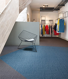
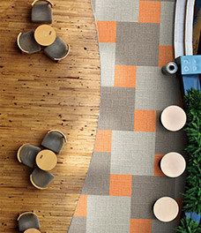
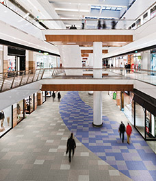
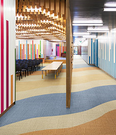
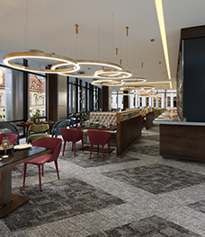
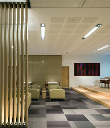
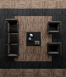
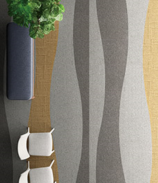
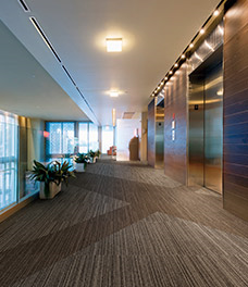
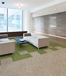
Retail & Public Space
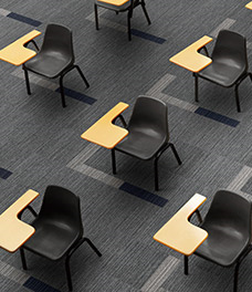
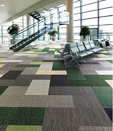
PLAN 01 (LX Series)
A design with bright, neutral gray and beige as its main colors, and accent colors tighten things up. The gentle gradations produced by differing patterns in the same color enable zoning to suit the purpose.
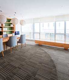
PLAN 02 (LX Series)
The lounge space decorated by adding a relaxing touch of green. A cohesive and calm space zoned by carpet.
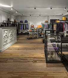
PLAN 03 (LX Series)
Textures that evoke the grain of wood are a universal design theme that people will never get tired of. The exquisite hues that cannot be found anywhere else will suit any space.
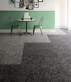
PLAN 04 (LX Series)
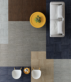
The kind of layout that can only be created by using tiles with the same color but different patterns. Combining LX2500 and LX2600 creates a space with a distinctive feel.
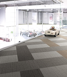
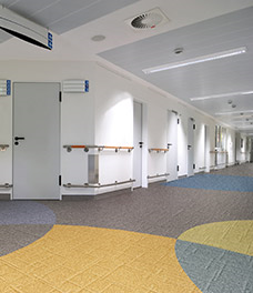
PLAN 05 (LX Series)
The way the colors are divided in large steps adds interest to the space.
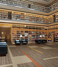
PLAN 06 (LX Series)
Navy colors that will suit any space, not just offices. If used in a school library, they can also be zoned to create areas where students can concentrate on studying and areas that nurture free thinking.
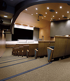
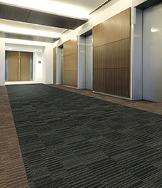
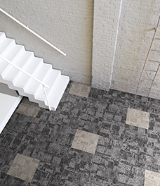
PLAN 07 (LX Series)
In a hall with lots of stairs, the seamless tile LX-1900 is best suited.
PLAN 08 (LX Series)
Just like on a tremendous canvas, this design imparts light and nature.
PLAN 09 (LX Series)
A design pattern inspired by a beach.
PLAN 10 (LX Series)
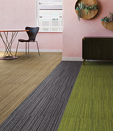
An elegant striped pattern chosen to go with the atmosphere of the store and products.
PLAN 11 (LX Series)
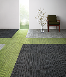
A stylish space inspired by bringing in the green from outside through the window.
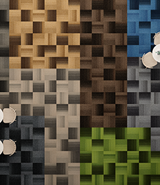
PLAN 12 (LX Series)
This layout uses LX-1200 tiles in the full range of colors. See how unique each one looks.
PLAN 13 (LX Series)
Desks are here to stay. There is an interesting pattern with design and meaning.
PLAN 14 (LP Series)
The vivid color scheme lends the space a playful vibe.
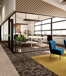
PLAN 15 (EX Series)
EX-1000 and EX-1100 have been combined to gently zone a meeting space and refresh corner.
PLAN 16 (EX Series)
Inspired by geometric patterns, this design will go well with objets and artworks.
PLAN 17 (EX Series)
EX-1000 and EX-1100 can be combined to create gentle zoning. The easy-to-use gray and brown color scheme will be a good match for a wide variety of spaces.
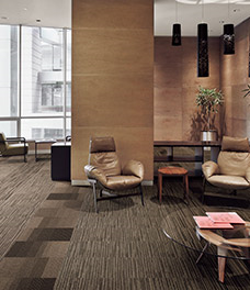
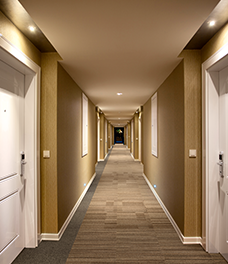
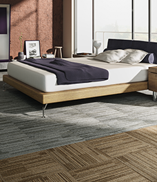
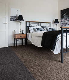
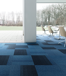
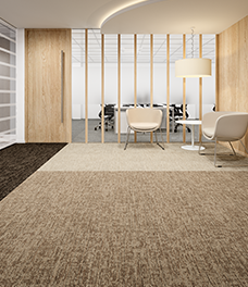
Hospitality
PLAN 01 (LX Series)
A calm space brought together with beige tones in a hotel room with a natural taste. Take a moment to relax.
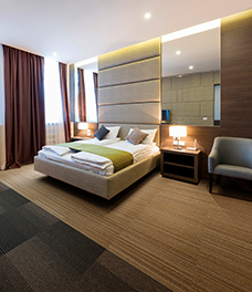
PLAN 02 (LX Series)
The square pattern with large differences in shading gives the space a modern feel.
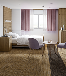
PLAN 03 (LX Series)
The large, diagonal color-blocking creates a sharp impression.
PLAN 04 (LX Series)
The design pasted using three shades of brown. An elegant and calm hotel-like space.
PLAN 05 (LX Series)
A relaxing, resort-like atmosphere.
PLAN 06 (LX Series)
A pattern of tiles that looks like a rug.
PLAN 07 (LX Series)
Woody warm colors to create a peaceful room.
PLAN 08 (LX Series)
Randomly arranging products with similar colors adds depth.
PLAN 09 (LX Series)
Use a colorful scheme to create a bright atmosphere.
PLAN 10 (LX Series)
Add interest to the space by using monotone gradations.
PLAN 11 (LX Series)
Scatter the focal points to add a sense of movement.
PLAN 12 (LX Series)
Here, a touch of interest has been added to the design by arranging tiles with the same color but different patterns to create a border on one side.
PLAN 13 (LX Series)
Make a small difference even in a narrow space. Put an accent against a wall, for instance.
PLAN 14 (LP Series)
With their excellent chemical resistance, these can used with the peace of mind that their colors will change relatively little even in medical settings.
PLAN 15 (LP Series)
A combination of vivid red and brown produces a space with an adult ambience.
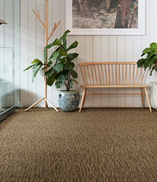
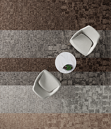
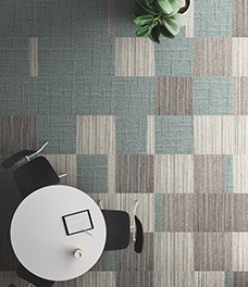
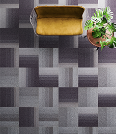
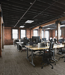
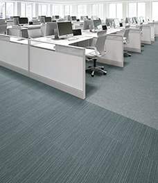
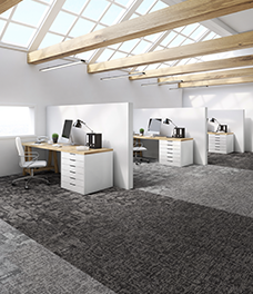
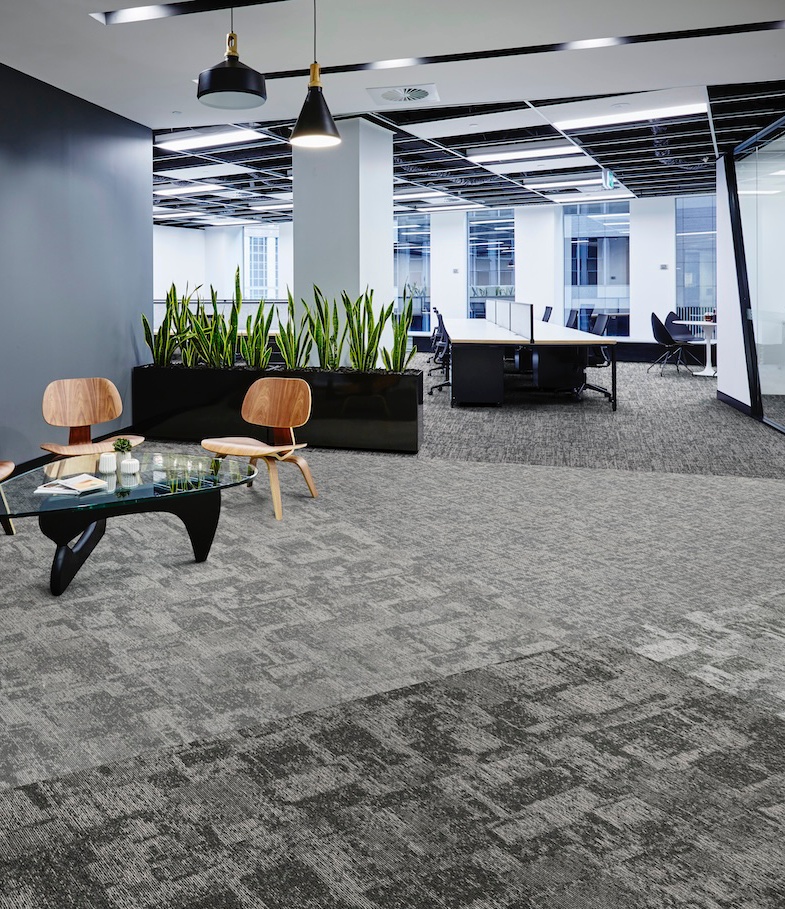
Corporate Office & Workplace
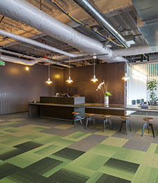
PLAN 01 (LX Series)
A natural space coordinated using green and beige tones. Colors that evoke the warmth of nature and a simple checkered pattern create a relaxed atmosphere, and encourage staff to interact with each other.
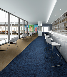
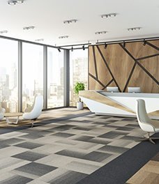
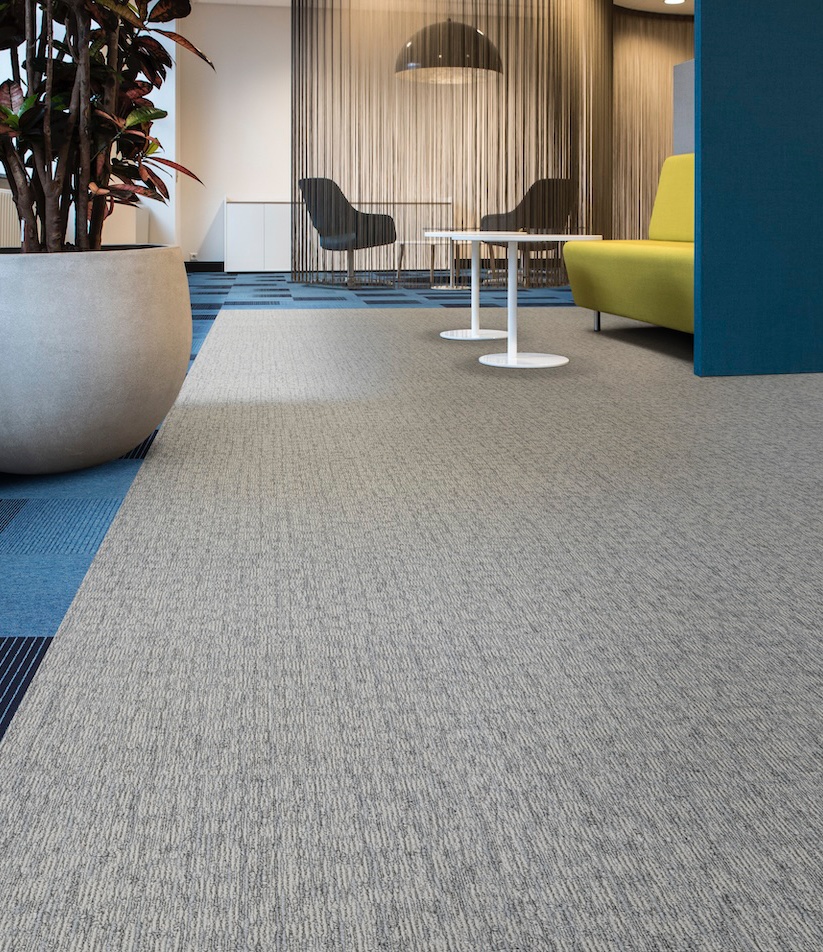
PLAN 02 (LX Series)
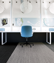
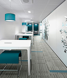
A design where a fresh blue accent looks effective in a space that has gray as the key tone. Giving impressions such as integrity, reliability, and calmness, navy is a versatile color that also works well in a variety of other spaces besides offices.
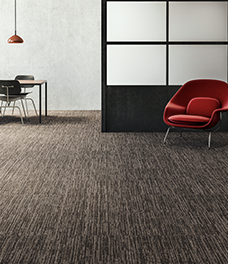
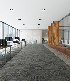
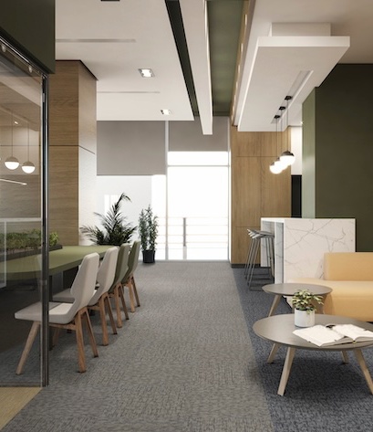
PLAN 03 (LX Series)
Neutral gray and beige can be adapted to both modern office spaces and wooden spaces. The work space and rest space are zoned by means of color and pattern gradations.
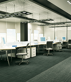
PLAN 04 (LX Series)
Using a combination of gray and navy, we added a playful vibe through a rhythmic pattern.
PLAN 05 (LX Series)
Colors that also go well with the wood, used to create a calm space where people can relax in between work.
PLAN 06 (LX Series)
A loosely zoned, relaxed design laid out in an open-plan office.
PLAN 07 (LX Series)
Playful borders produced by carpet tiles with gradations. LX-2700 can be used in plain tones, making it a design that is easy to combine with any pattern.
PLAN 08 (LX Series)
This design uses a color layout that fits in with the space, and combines LX-2500 and LX-2600 to form a gradation.
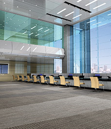
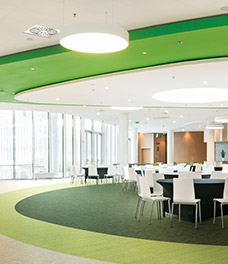
PLAN 09 (LX Series)
An impressive office entrance created by a boldly switching design.
PLAN 10 (LX Series)
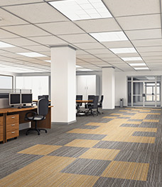
A new neutral gray color has been added to the popular LX-2500 and LX-2600 series, whose pattern gradations make them great fun to coordinate with.
PLAN 11 (LX Series)
A pattern created with zoning in mind. Yellow is added as an accent.
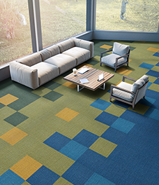
PLAN 12 (LX Series)
Pasted using shades of navy to create transparency. Giving a refreshing and modern impression.
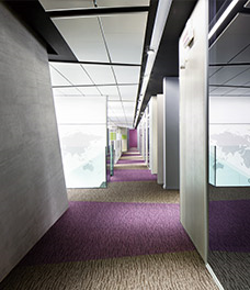
PLAN 13 (LX Series)
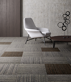
Combining differing patterns in the same color to create a space that leaves a lasting impression. The impression will change drastically depending on the combination with the furniture.
PLAN 14 (LX Series)
Using different tiles creates aisles even when there are no walls.
PLAN 15 (LX Series)
The lines are sharply laid out with modernist touch. A flooring plan for large spaces.
PLAN 16 (LX Series)
Adding a wave pattern to a cold, hard space makes it feel softer.
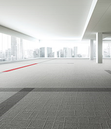
PLAN 17 (LX Series)
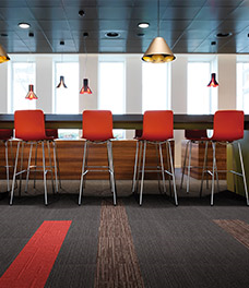
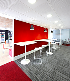
The key color here is red. Look at the floor, wall and floor to enjoy the color switching.
PLAN 18 (LX Series)
A bold design created with zoning in mind.
PLAN 19 (LX Series)
A totally coordinated scheme that uses matching colors for the walls, floors, and furniture.
PLAN 20 (LX Series)
LX-1500 tiles look beautiful laid in a simple arrangement.
PLAN 21 (LX Series)
Based on soft beige and gray tones to create a bright and open space.
PLAN 22 (LX Series)
Will suit any floor plan, be it a large space or use as an accent.
PLAN 23 (LX Series)
A vivid red chair adds a splash of color that contrasts with the chic floor.
PLAN 24 (LX Series)
Simply creating check patterns with single-color LX-1200 tiles offers a wealth of design possibilities.
PLAN 25 (LX Series)
Mother Nature’s colors sprinkled here and there. Healing effect ingeniously added in workplaces.
PLAN 26 (LX Series)
The matching colors on the wall and floor give the space a sense of unity.
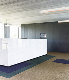
PLAN 27 (LX Series)
Light and calm colors for the rest space.
PLAN 28 (LX Series)
A sophisticated design with a focal color that matches the furniture.
PLAN 29 (LX Series)
Providing sense of asymmetric space accentuated with a bold cross.
PLAN 30 (LP Series)
This is a standard, timeless office space.
PLAN 31 (LP Series)
A calm office created by coordinating harmonious coloring and simple patterns.
PLAN 32 (LP Series)
The look resulting from being particular about the mix of yarn is a design you can use for a long time without ever getting tired of. Accent colors are used for the pathways.
PLAN 33 (LP Series)
The sense of mixture it conveys makes LP-3100 a good match for a wide variety of spaces.
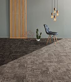
PLAN 34 (EX Series)
Coordination based on brown, to go with a space characterized by brickwork and wood. The bold layout of the design adds accents to the natural space.